silverwind
4f1ce4fa79
Introduce .secondary-nav and handle .page-content spacing universally ( #29982 )
...
Fixes: https://github.com/go-gitea/gitea/issues/29981 . Introduce
`.secondary-nav` as a universal way for styling and margin adjustments
inside `.page-content`.
If the first child of `.page-content` is `.secondary-nav`, we add margin
below it, otherwise we add padding to the first child. Notable changes:
- `--color-header-wrapper` is replaced with `--color-secondary-nav-bg`.
- `navbar` class is removed.
---------
Co-authored-by: Giteabot <teabot@gitea.io >
Co-authored-by: wxiaoguang <wxiaoguang@gmail.com >
2024-03-22 23:54:09 +00:00
silverwind
fe9ebd0ae7
Remove fomantic site module ( #29980 )
...
Had to fiddle a bit with the css ordering, but seems to work well now
and should render exactly like before. Some of the CSS may be
unnecessary, but I kept it for now.
2024-03-22 11:47:50 +00:00
wxiaoguang
7db99fa60e
Refactor repo header/list ( #29969 )
...
1. Use general "mobile-only" and "not-mobile" CSS styles, remove some`@media (max-width: 767.98px)` tricks
2. Use `CountFmt` for repo list, just like the repo header (and it matches GitHub, to avoid big numbers bloat the page)
2024-03-21 17:04:03 +00:00
silverwind
01fd80546f
Fix various loading states, remove .loading class ( #29920 )
...
Various code was using fomantic `loading` class which I think got broken
a while ago and rendered only a full circle. Fix those to use
`is-loading`.
Before:
<img width="295" alt="Screenshot 2024-03-19 at 22 56 26"
src="https://github.com/go-gitea/gitea/assets/115237/dbe83395-5db4-4868-90bc-3613866a35f0 ">
After:
<img width="60" alt="Screenshot 2024-03-19 at 22 54 35"
src="https://github.com/go-gitea/gitea/assets/115237/8ac19b7e-035a-4c6d-850b-53a234ef69c2 ">
<img width="294" alt="Screenshot 2024-03-19 at 22 54 56"
src="https://github.com/go-gitea/gitea/assets/115237/34e819d7-25f7-43a1-9d48-4a68dcd2b6ad ">
<img width="320" alt="Screenshot 2024-03-19 at 22 55 16"
src="https://github.com/go-gitea/gitea/assets/115237/05127544-47ff-4e18-9fd8-c84e44c374f8 ">
<img width="153" alt="Screenshot 2024-03-19 at 23 01 43"
src="https://github.com/go-gitea/gitea/assets/115237/a33248c6-b11d-40ff-82d8-f5a3d85b55aa ">
<img width="1300" alt="Screenshot 2024-03-19 at 23 56 25"
src="https://github.com/go-gitea/gitea/assets/115237/562ca876-b5d5-4295-961e-9d2cdab31ab0 ">
<img width="136" alt="Screenshot 2024-03-20 at 00 00 38"
src="https://github.com/go-gitea/gitea/assets/115237/44838ac4-67f3-4fec-a8e3-978cc5dbdb72 ">
2024-03-21 16:31:15 +00:00
silverwind
05168e05d3
Add background to dashboard navbar, fix missing padding ( #29940 )
...
Two small CSS fixes:
1. Add background and reduced padding/avatar size to dashboard navbar.
We use that background already in a number of "secondary navbars", so it
fits.
<img width="1344" alt="Screenshot 2024-03-20 at 18 18 21"
src="https://github.com/go-gitea/gitea/assets/115237/ce5ebedc-e607-42c7-b7b4-b7a4c0ee68f2 ">
2. Fix padding on top of user settings and subscriptions, regressed by
https://github.com/go-gitea/gitea/pull/29922 .
2024-03-20 18:33:00 +00:00
silverwind
ae1a65d935
Prevent layout shift in <overflow-menu> items ( #29831 )
...
There is a small layout shift in when active tab changes. Notice how the
actions SVG is unstable:
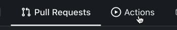
This is because the active item with bold text is wider then the
inactive one. I have applied [this
trick](https://stackoverflow.com/a/32570813/808699 ) to prevent this
layout shift. It's only active inside `<overflow-menu>` because I wanted
to avoid changing HTML and doing it in regular JS would cause a flicker.
I don't expect us to introduce other similar menus without
`<overflow-menu>`, so that place is likely fine.
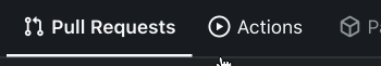
I also changed the weight from 500 to 600, slightly reduced horizontal
padding, merged some tab-bar related CSS rules and a added a small
margin below repo-header so it does not look so crammed against the
buttons on top.
---------
Co-authored-by: wxiaoguang <wxiaoguang@gmail.com >
2024-03-20 17:00:35 +00:00
silverwind
8d7bf9e17b
Remove the negative margin from .page-content ( #29922 )
...
The negative margin was suboptimal and presents a few unnecessary
challenges while styling the page. Remove it and add custom margin
values, which slightly changes the height a few things near the top of
the page as well:
15px less height of explore and login navbar:
<img width="899" alt="Screenshot 2024-03-20 at 00 52 34"
src="https://github.com/go-gitea/gitea/assets/115237/72a01ca4-5d17-4a0f-b915-61f95054fcb1 ">
15px reduced padding-top height of "user bar" and equal 4px padding
added:
<img width="484" alt="Screenshot 2024-03-20 at 00 52 50"
src="https://github.com/go-gitea/gitea/assets/115237/a8507e6d-372d-4a8b-9048-66fcf8a5facd ">
3px less padding on top of repo:
<img width="552" alt="Screenshot 2024-03-20 at 00 53 49"
src="https://github.com/go-gitea/gitea/assets/115237/dede6e44-7688-440f-a1b6-13532638ae03 ">
2024-03-20 11:21:18 +00:00
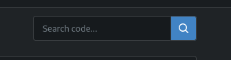
silverwind
130d75a0d4
Fix border on focus in dashboard repo search ( #29893 )
...
Before:
<img width="449" alt="Screenshot 2024-03-18 at 22 35 10"
src="https://github.com/go-gitea/gitea/assets/115237/f2893870-e7a3-4e34-b0cf-4610735c9b36 ">
After:
<img width="453" alt="image"
src="https://github.com/go-gitea/gitea/assets/115237/36a9f800-28a4-40fc-b6d2-a2e717ddba01 ">
2024-03-19 10:36:54 +00:00
silverwind
808801a246
Remove fomantic message module ( #29856 )
...
Remove this CSS-only module, which gives a nice reduction in CSS size.
Should look exactly like before.
2024-03-17 11:21:14 +08:00
silverwind
89d9d94812
add .suppressed link class ( #29847 )
...
Extract from https://github.com/go-gitea/gitea/pull/29344 . With this
class it's possible to have links that don't color on hover. It will be
useful for https://github.com/go-gitea/gitea/pull/29429 .
2024-03-16 17:58:58 +01:00
wxiaoguang
815bfaebc1
Refactor markdown attention render ( #29833 )
...
* Remove some deadcode
* Use 2-word name for CSS class names
* Remove "gt-*" rules for sanitizer

The UI doesn't change much.
2024-03-16 11:34:38 +00:00
wxiaoguang
89208d8f62
Improve repo search UI ( #29767 )
...
1. Introduce a special "flex-items-block" for menu items, to align the
dropdown menu items
2. Simplify the "repo search" form
3. Add missing "TopicOnly" search option
Screenshots:
The old UI items don't align:
<details>

</details>
New UI (doesn't change much, but the items align)
<details>


</details>
---------
Co-authored-by: silverwind <me@silverwind.io >
2024-03-15 09:45:30 +00:00
silverwind
8b45a62222
Remove scrollbar customizations ( #29800 )
...
Fixes https://github.com/go-gitea/gitea/issues/29652 . Removes all
scrollbar customization as per popular vote on
https://github.com/go-gitea/gitea/issues/29652#issuecomment-1985846162 .
There is one more case of `-webkit-scrollbar` left in CSS and
https://github.com/go-gitea/gitea/pull/29400 will get rid of that as
well.
2024-03-15 04:45:45 +00:00
silverwind
645e3cbc94
Add <overflow-menu>, rename webcomponents ( #29400 )
...
1. Add `<overflow-menu>` web component
2. Rename `<gitea-origin-url>` to `<origin-url>` and make filenames
match.
<img width="439" alt="image"
src="https://github.com/go-gitea/gitea/assets/115237/2fbe4ca4-110b-4ad2-8e17-c1e116ccbd74 ">
<img width="444" alt="Screenshot 2024-03-02 at 21 36 52"
src="https://github.com/go-gitea/gitea/assets/115237/aa8f786e-dc8c-4030-b12d-7cfb74bdfd6e ">
<img width="537" alt="Screenshot 2024-03-03 at 03 05 06"
src="https://github.com/go-gitea/gitea/assets/115237/fddd50aa-adf1-4b4b-bd7f-caf30c7b2245 ">

TODO:
- [x] Check if removal of `requestAnimationFrame` is possible to avoid
flash of content. Likely needs a `MutationObserver`.
- [x] Hide tippy when button is removed from DOM.
- [x] ~~Implement right-aligned items
(https://github.com/go-gitea/gitea/pull/28976 )~~. Not going to do it.
- [x] Clean up CSS so base element has no background and add background
via tailwind instead.
- [x] Use it for org and user page.
---------
Co-authored-by: Giteabot <teabot@gitea.io >
Co-authored-by: wxiaoguang <wxiaoguang@gmail.com >
2024-03-15 02:05:31 +00:00
Denys Konovalov
e18d30abe2
Unify search boxes ( #29530 )
...
Unify all but a few search boxes to use uniform style, uniform
translations and shared templates where possible.
Remove a few duplicated search templates, e. g. code search.
<details><summary>Example after screenshots:</summary>


</details>
Also includes #29700
Co-authored-by: 6543 <6543@obermui.de >
---------
Co-authored-by: 6543 <m.huber@kithara.com >
Co-authored-by: 6543 <6543@obermui.de >
Co-authored-by: silverwind <me@silverwind.io >
Co-authored-by: Giteabot <teabot@gitea.io >
2024-03-14 23:24:59 +00:00
silverwind
557961488a
Completely style the webkit autofill ( #29683 )
...
Previously it was only partially styled, e.g. there was black text on
white background even in dark theme caused by fomantic styles.
<img width="195" alt="image"
src="https://github.com/go-gitea/gitea/assets/115237/bc5cf516-2aef-45c3-854a-c9f5497aacca ">
<img width="195" alt="Screenshot 2024-03-09 at 02 09 29"
src="https://github.com/go-gitea/gitea/assets/115237/ef0af17d-6e0b-402e-b24d-bfa34dc2f4e0 ">
Co-authored-by: Giteabot <teabot@gitea.io >
2024-03-09 12:14:42 +00:00
silverwind
57a770213c
Style fomantic grey labels ( #29458 )
...
Fomantic grey labels in the dashboard repo lists were showing original
fomantic colors, fixed that. Also slightly tweaked the light theme
colors so it uses same opacity values as dark theme.
<img width="165" alt="Screenshot 2024-03-07 at 21 06 23"
src="https://github.com/go-gitea/gitea/assets/115237/72744d6f-2ee1-4e5d-8ba0-b482a446f535 ">
<img width="167" alt="Screenshot 2024-03-07 at 21 06 00"
src="https://github.com/go-gitea/gitea/assets/115237/1ba93775-e5a9-4b28-b90f-59c1e9199687 ">
2024-03-08 09:42:12 +00:00
silverwind
83319cd366
Improve contrast on blame timestamp, fix double border ( #29482 )
...
Before, double border on top, bad contrast on dark:
<img width="155" alt="Screenshot 2024-02-29 at 02 06 17"
src="https://github.com/go-gitea/gitea/assets/115237/fc0f1e08-a5ce-47ed-9eb6-135eed5a1abb ">
<img width="126" alt="Screenshot 2024-02-29 at 02 07 28"
src="https://github.com/go-gitea/gitea/assets/115237/38ae8483-8d9b-484c-8909-d4466131ea16 ">
After, no double border on top, good contrast:
<img width="154" alt="Screenshot 2024-02-29 at 02 20 20"
src="https://github.com/go-gitea/gitea/assets/115237/ad91282b-e9f5-4f41-8f5e-6ba28db3beac ">
<img width="147" alt="Screenshot 2024-02-29 at 02 20 38"
src="https://github.com/go-gitea/gitea/assets/115237/7ee2ec92-e72a-4981-aec3-98fc8e579bae ">
2024-02-29 10:00:33 +08:00
silverwind
551ef9ced6
Add tailwindcss ( #29357 )
...
This will get tailwindcss working on a basic level. It provides only the
utility classes, e.g. no tailwind base which we don't need because we
have our own CSS reset. Without the base, we also do not have their CSS
variables so a small amount of features do not work and I removed the
generated classes for them.
***Note for future developers: This currently uses a `tw-` prefix, so we
use it like `tw-p-3`.***
<details>
<summary>Currently added CSS, all false-positives</summary>
```
.\!visible{
visibility: visible !important
}
.visible{
visibility: visible
}
.invisible{
visibility: hidden
}
.collapse{
visibility: collapse
}
.static{
position: static
}
.\!fixed{
position: fixed !important
}
.absolute{
position: absolute
}
.relative{
position: relative
}
.sticky{
position: sticky
}
.left-10{
left: 2.5rem
}
.isolate{
isolation: isolate
}
.float-right{
float: right
}
.float-left{
float: left
}
.mr-2{
margin-right: 0.5rem
}
.mr-3{
margin-right: 0.75rem
}
.\!block{
display: block !important
}
.block{
display: block
}
.inline-block{
display: inline-block
}
.inline{
display: inline
}
.flex{
display: flex
}
.inline-flex{
display: inline-flex
}
.\!table{
display: table !important
}
.inline-table{
display: inline-table
}
.table-caption{
display: table-caption
}
.table-cell{
display: table-cell
}
.table-column{
display: table-column
}
.table-column-group{
display: table-column-group
}
.table-footer-group{
display: table-footer-group
}
.table-header-group{
display: table-header-group
}
.table-row-group{
display: table-row-group
}
.table-row{
display: table-row
}
.flow-root{
display: flow-root
}
.inline-grid{
display: inline-grid
}
.contents{
display: contents
}
.list-item{
display: list-item
}
.\!hidden{
display: none !important
}
.hidden{
display: none
}
.flex-shrink{
flex-shrink: 1
}
.shrink{
flex-shrink: 1
}
.flex-grow{
flex-grow: 1
}
.grow{
flex-grow: 1
}
.border-collapse{
border-collapse: collapse
}
.select-all{
user-select: all
}
.resize{
resize: both
}
.flex-wrap{
flex-wrap: wrap
}
.overflow-visible{
overflow: visible
}
.rounded{
border-radius: 0.25rem
}
.border{
border-width: 1px
}
.text-justify{
text-align: justify
}
.uppercase{
text-transform: uppercase
}
.lowercase{
text-transform: lowercase
}
.capitalize{
text-transform: capitalize
}
.italic{
font-style: italic
}
.text-red{
color: var(--color-red)
}
.text-shadow{
color: var(--color-shadow)
}
.underline{
text-decoration-line: underline
}
.overline{
text-decoration-line: overline
}
.line-through{
text-decoration-line: line-through
}
.outline{
outline-style: solid
}
.ease-in{
transition-timing-function: cubic-bezier(0.4, 0, 1, 1)
}
.ease-in-out{
transition-timing-function: cubic-bezier(0.4, 0, 0.2, 1)
}
.ease-out{
transition-timing-function: cubic-bezier(0, 0, 0.2, 1)
}
```
</details>
---------
Co-authored-by: Giteabot <teabot@gitea.io >
2024-02-25 17:46:46 +01:00
silverwind
ecf7fdc976
Clean up diff header css and reduce global textarea min-height ( #29232 )
...
1. Tweak diff header and remove a numbe of unneeded CSS for it:
Before:
<img width="433" alt="Screenshot 2024-02-18 at 01 08 09"
src="https://github.com/go-gitea/gitea/assets/115237/d8b377c0-57bc-44d5-bb57-a582c7d4b3b4 ">
After:
<img width="463" alt="Screenshot 2024-02-18 at 01 07 56"
src="https://github.com/go-gitea/gitea/assets/115237/d08c17e7-5b86-4d07-81da-6371f4754325 ">
3. Reduce height of review textarea and also reduce fomantic's CSS from
12em to 8em. Now fits better on my screen:
<img width="1352" alt="image"
src="https://github.com/go-gitea/gitea/assets/115237/5c658d13-295e-4929-94da-13ade888020d ">
---------
Co-authored-by: delvh <dev.lh@web.de >
2024-02-18 14:51:21 +00:00
Tim-Nicas Oelschläger
8b1c6d9d69
Change webhook-type in create-view ( #29114 )
...
It's now possible to change webhook-type in create-view.
before:
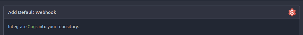
after:

---------
Co-authored-by: silverwind <me@silverwind.io >
Co-authored-by: Giteabot <teabot@gitea.io >
2024-02-15 14:59:48 +01:00
Yarden Shoham
46c986ae00
Add alert blocks in markdown ( #29121 )
...
- Follows https://github.com/go-gitea/gitea/pull/21711
- Closes https://github.com/go-gitea/gitea/issues/28316
Implement GitHub's alert blocks markdown feature
Docs:
-
https://docs.github.com/en/get-started/writing-on-github/getting-started-with-writing-and-formatting-on-github/basic-writing-and-formatting-syntax#alerts
- https://github.com/orgs/community/discussions/16925
### Before
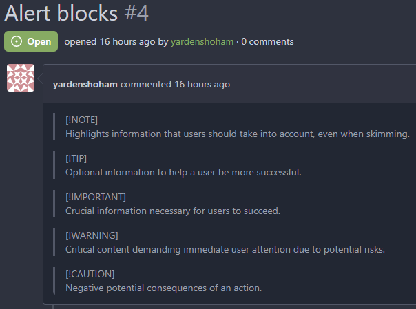
### After

## ⚠️ BREAKING ⚠️
The old syntax no longer works
How to migrate:
If you used
```md
> **Note** My note
```
Switch to
```md
> [!NOTE]
> My note
```
---------
Signed-off-by: Yarden Shoham <git@yardenshoham.com >
Co-authored-by: silverwind <me@silverwind.io >
Co-authored-by: Giteabot <teabot@gitea.io >
2024-02-10 18:43:09 +00:00
KN4CK3R
5cd1e692a5
Improve user search display name ( #29002 )
...
I tripped over this strange method and I don't think we need that
workaround to fix the value.
old:
new:
---------
Co-authored-by: silverwind <me@silverwind.io >
Co-authored-by: wxiaoguang <wxiaoguang@gmail.com >
2024-02-01 17:10:16 +00:00
wxiaoguang
228d2f8588
Fix button size in "attached header right" ( #28770 )
...
Before:
<details>

</details>
After:


2024-01-12 14:43:40 +00:00
Denys Konovalov
abc37d6a62
Revamp repo header ( #27760 )
...
Redesign repo header with following new aspects:
- responsive & better-looking repo title
- hide repo button text instead of icons in mobile view
- use same tab style as on explore and org page
<details>
<summary>Before:</summary>


</details>
<details>
<summary>After:</summary>


2024-01-12 03:44:06 +00:00
yp05327
ddca58bdeb
Add word-break to organization name and description ( #26624 )
...
Fix #24318
Before:


After:


2023-10-25 10:40:39 +00:00
wxiaoguang
7f8371e31d
Improve dropdown button alignment and fix hover bug ( #27632 )
...
1. fix #27631 , and add samples to devtest page
2. fix incorrect color for "ui dropdown button" when hover
2023-10-16 07:26:08 +00:00
silverwind
2024541334
Enable shorthands in declaration-strict-value linter ( #27597 )
...
Enable [shorthand
matching](https://github.com/AndyOGo/stylelint-declaration-strict-value#expandshorthand )
in this lint rule and match color properties by regex. Patterns like
this will now fail lint:
```css
background: #123456 ;
border: 1px sold rgba(0,0,0,0);
```
2023-10-13 08:19:21 +00:00
silverwind
d49c87de5e
Rename the default themes to gitea-light, gitea-dark, gitea-auto ( #27419 )
...
Part of https://github.com/go-gitea/gitea/issues/27097 :
- `gitea` theme is renamed to `gitea-light`
- `arc-green` theme is renamed to `gitea-dark`
- `auto` theme is renamed to `gitea-auto`
I put both themes in separate CSS files, removing all colors from the
base CSS. Existing users will be migrated to the new theme names. The
dark theme recolor will follow in a separate PR.
## ⚠️ BREAKING ⚠️
1. If there are existing custom themes with the names `gitea-light` or
`gitea-dark`, rename them before this upgrade and update the `theme`
column in the `user` table for each affected user.
2. The theme in `<html>` has moved from `class="theme-name"` to
`data-theme="name"`, existing customizations that depend on should be
updated.
---------
Co-authored-by: Lunny Xiao <xiaolunwen@gmail.com >
Co-authored-by: Giteabot <teabot@gitea.io >
2023-10-06 09:46:36 +02:00
Denys Konovalov
dffa3b8e74
link to file from its history ( #27354 )
...
Fixes #3852
Fixes https://github.com/go-gitea/gitea/issues/26707
Add a button on file history which directs you to the file at the
selected commit.
Co-authored-by: silverwind <me@silverwind.io >
2023-10-02 04:04:32 +00:00
wxiaoguang
e34d054926
Improve branch list UI ( #27319 )
...
1. Put the `"octicon-shield-lock"` into the flex container, then it
doesn't need a separate flex box
2. Remove some unnecessary `gt-df` helpers
3. Make `btn` button has the same flex behavior as `ui button`

2023-09-28 04:04:32 +00:00
silverwind
edf0a48ab4
Use mask-based fade-out effect for .new-menu ( #27181 )
...
The `.new-menu` was using a pseudo-element based fade-out effect.
Replace this with a more modern mask-based effect which in this case
required a child element to avoid fading out the background as well, so
I applied it to child `new-menu-inner` which was present on all these
menus except explore where I added it.
There is no visual difference except that the items on the explore page
have no `gap` between them any longer, making it consistent with other
menus. Before and after:
<img width="221" alt="Screenshot 2023-09-21 at 21 13 19"
src="https://github.com/go-gitea/gitea/assets/115237/b4a38ce2-cee1-4c54-84a5-e1d0bfd79e29 ">
<img width="222" alt="Screenshot 2023-09-21 at 21 32 36"
src="https://github.com/go-gitea/gitea/assets/115237/bb6b1335-d935-4ad4-bb85-3b0fc3027c2b ">
Also, this cleans up the related CSS vars:
- `--color-header-wrapper-transparent` is removed, no longer needed
- `--color-header-wrapper` is defined in base theme as well, was
previously unset and therefor transparent.
[no whitespace
diff](https://github.com/go-gitea/gitea/pull/27181/files?diff=unified&w=1 )
[demo of mask fade](https://jsfiddle.net/silverwind/tsfadb3u/ )
2023-09-25 01:03:00 +00:00
wxiaoguang
94861b9e9a
Fix repo sub menu ( #27169 )
...
Fix #27166
2023-09-21 21:16:14 +08:00
puni9869
0ad0e933f8
Display archived labels specially when listing labels ( #26820 )
...
Follow up https://github.com/go-gitea/gitea/pull/26741
Changes:
Added archived label for org labels and added into issue filter list.
Part of https://github.com/go-gitea/gitea/issues/25237
---------
Signed-off-by: puni9869 <punitinani1@hotmail.com >
Co-authored-by: silverwind <me@silverwind.io >
2023-09-18 04:54:05 +00:00
Kerwin Bryant
cba5f76e8c
Fix Fomantic's line-height causing vertical scrollbars to appear ( #26961 )
...
Before:

After:

---
1. **Remove the scroll bar exception that in the a tag**
2. **Reduce the actual width of the a tag to the actual width of the
content**
As shown in the screenshot, the red box area should not be clickable
2023-09-13 09:08:45 +00:00
wxiaoguang
3b31f85d0f
Add "dir=auto" for input/textarea elements by default ( #26735 )
...
Co-authored-by: silverwind <me@silverwind.io >
Co-authored-by: Giteabot <teabot@gitea.io >
2023-09-07 08:00:20 +00:00
Kerwin Bryant
a07ac254ce
Fix UI anomalies ( #26929 )
2023-09-06 07:00:45 +00:00
wxiaoguang
c0d1b6c5b9
Remove CSS has selector and improve various styles ( #26891 )
...
Replace #26850
Major changes:
1. Remove all `has` selectors, it is still not supported by firefox.
Actually there could be some more general and clearer approaches
2. Remove `two-toggle-buttons`, the `.ui.buttons` just works well
3. Rewrite the `.ui.buttons` border styles, see the screenshots
4. Remove the "fine-tuning" paddings from the the flex children, they
could layout themselves well.


2023-09-04 18:22:46 +08:00
wxiaoguang
d20b14b65e
Refactor "shortsha" ( #26877 )
...
The old code used complex `if` blocks and strange HTML layouts.
<details>

</details>
This PR refactors the template code and remove legacy CSS styles. The UI
doesn't change much.

2023-09-03 02:58:52 +00:00
6543
f8af5c2cb8
Make it posible to customize nav text color via css var ( #26807 )
...
---
*Sponsored by Kithara Software GmbH*
2023-09-02 05:10:41 +02:00
wxiaoguang
7bf875d1d4
Remove some unused CSS styles ( #26852 )
...
1. `icons`: globally searched, no use in templates.
2. toast's `display: inline-block;`: there is a `display: flex` below.
2023-09-01 08:59:38 +02:00
wxiaoguang
b42b36c106
Remove "TODO" tasks from CSS file ( #26835 )
...
1. Use `gt-invisible` instead of `invisible`.
2. Use `gt-word-break` instead of `dont-break-out` (there is a slight
different "hyphens", but I think it won't affect too much since it is
only used for the "full name").
3. Remove `.small.button:has(svg)` , now our buttons could layout SVG
correctly, and actually I didn't see this CSS class is used in code.
2023-08-31 10:49:53 +00:00
silverwind
bc916a9f51
Render code blocks in repo description ( #26830 )
...
Backtick syntax now works in repo description too. Also, I replaced the
CSS for this was a new single class, making it more flexible and not
dependent on a parent. Also, very slightly reduced font size from 16.8px
to 16px.
---------
Co-authored-by: wxiaoguang <wxiaoguang@gmail.com >
2023-08-31 05:01:01 +00:00
wxiaoguang
0651bf734e
Remove polluted .ui.right ( #26825 )
...
Each change is tested manually line by line. There are too many changes
so I can't share dozens of screenshots.

In short:

1. `ui right` could be still used in `ui top attached header`, because
there is a special case.
2. A lot of `ui right` are just no-op, so they can be removed safely.
3. Some of the `ui right` should be replaced by `gt-float-right` (to
avoid breaking, leave them to the future).
4. A few of the `ui right` could be rewritten by flex.
2023-08-31 02:29:59 +00:00
wxiaoguang
8677da76f5
Remove polluted ".ui.left" style ( #26809 )
2023-08-30 21:46:24 +08:00
delvh
36e459069b
Remove fomantic text module ( #26777 )
...
Corollary to #26775 :
All selectors I found that are actually used and not necessarily present
in the current code have been copied to `web_src/css/base.css`.
Everything else should be a clean removal.
2023-08-30 10:37:17 +00:00
wxiaoguang
d3aa67defa
Fix notification circle (border-radius) ( #26794 )
...
`border-radius` means `radius`, not `diameter`, so it should be `50%` and `boxHeight / 2`
2023-08-29 14:03:34 +00:00
delvh
9d105ba83d
Unify border-radius behavior ( #26770 )
...
## Changes
- no more hardcoded `border-radius`es (apart from `0`)
- no more value inconsistencies
- no more guessing what pixel value you should use
- two new variables:
- `--border-radius-medium` (for elements where the normal border radius
does not suffice)
- `--border-radius-circle` (for displaying circles)
---------
Co-authored-by: silverwind <me@silverwind.io >
2023-08-28 19:43:59 +00:00
wxiaoguang
7c225dceaa
Refactor some CSS styles and simplify code ( #26771 )
...
Refactor some CSS styles and simplify code.

Some styles are not in use, remove them.
2023-08-28 22:14:51 +08:00
wxiaoguang
f8e48b3d02
Use line-height: normal by default ( #26635 )
...
Fix #26537 again because 1.15 is too small for some fonts.
2023-08-22 10:19:15 +00:00