Kyle D
31d4097bf9
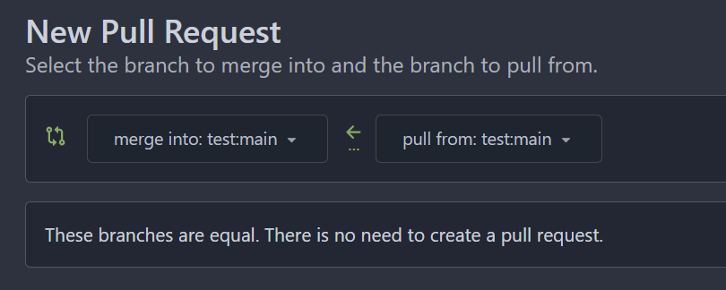
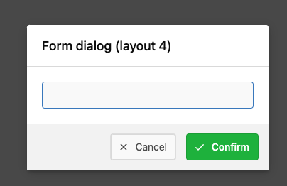
Add merge arrow direction and update styling ( #28523 )
...
Close https://github.com/go-gitea/gitea/issues/28522
~Adds some [negative
margin](https://tailwindcss.com/docs/margin#using-negative-values )
helper css classes using tailwind's [prefix
syntax](https://tailwindcss.com/docs/configuration#prefix )~
### Before
### After
2024-01-05 17:38:56 +00:00
Earl Warren
fb5d235193
Apply min-height in wiki only on preview pane ( #28687 )
...
In the commit 1e4d7140c3https://codeberg.org/forgejo/forgejo/pulls/2080
(cherry picked from commit 8f0baefe5dadc929fe7456c36c8b205e96f228f0)
Co-authored-by: Fl1tzi <git@fl1tzi.com >
2024-01-04 02:48:55 +00:00
Denys Konovalov
08debf8183
Fix wrapping of label list ( #28684 )
...
The label list needs to wrap the items to avoid unnecessary overflow / incorrect text wrapping.
2024-01-03 20:33:55 +08:00
wxiaoguang
5a556c7cca
Fix flex container width ( #28603 )
...
Fix #28489
2023-12-24 22:39:02 +08:00
KazzmanK
0624668055
Decrease issue font size in project template ( #28054 )
...
I propose to decrease font size. 18 is too big and looks ugly, on
windows. 14 is on par with other elements and save a bit of space.


Co-authored-by: Nikolay Kobzarev <n.kobzarev@aeronavigator.ru >
2023-11-19 02:02:26 +00:00
sebastian-sauer
87d0bcebd8
Fix Show/hide filetree button on small displays ( #27881 )
...
the gt-df's display:flex !important did override the display:none on small displays
---------
Co-authored-by: wxiaoguang <wxiaoguang@gmail.com >
2023-11-17 18:35:51 +00:00
sebastian-sauer
aae0f0d351
Improve PR diff view on mobile ( #27883 )
...
1. Show diff stats only on large screens
these are already shown in tabs, so no need for this duplicate
information on small screens
2. Hide viewed files information on small screens
Github does the same and this gives us more free space on small screens

3. Review bar now doesn't wrap so we don't need the 77px even on very
small screens
(the sticky headers are still working)

2023-11-16 11:58:53 +08:00
yp05327
df253d8863
Add word-break to repo description in home page ( #27924 )
...
In #25315 , @denyskon fixed UI on mobile view.
But for the repo description, on desktop view there's no word-break.
So maybe we can just add `gt-word-break` to fix it on both mobile view
and desktop view.
Before:
desktop view:

mobile view:

After:
desktop view:

mobile view(almost same?)

---------
Co-authored-by: silverwind <me@silverwind.io >
2023-11-07 23:52:08 +00:00
wxiaoguang
ee9b6a9b79
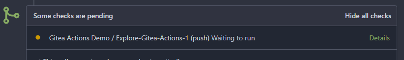
Fix the overflow style for "Hide all checks" ( #27932 )
...
Fix #27928
---------
Co-authored-by: silverwind <me@silverwind.io >
2023-11-07 18:53:35 +00:00
yp05327
f745d5f2b4
Add Hide/Show all checks button to commit status check ( #26284 )
...
Step one for a GitHub like commit status check ui:
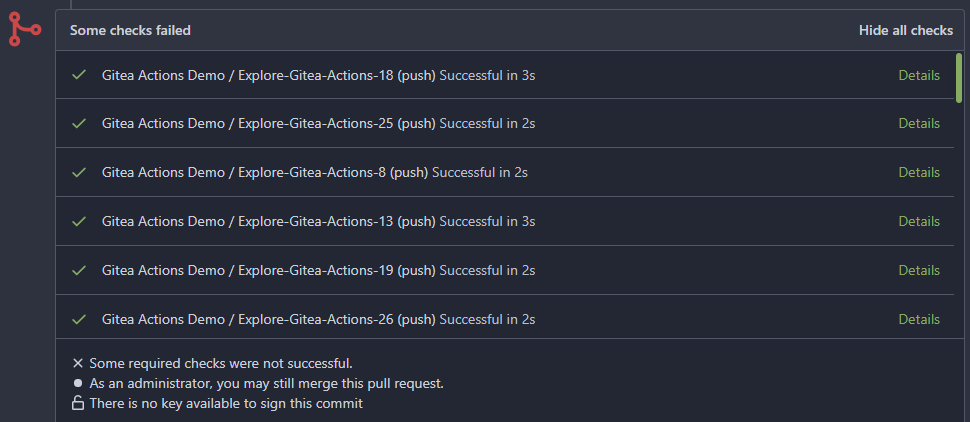
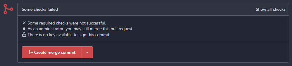
Step two:


The design now will list all commit status checks which takes too much
space.
This is a pre-improve for #26247
---------
Co-authored-by: delvh <dev.lh@web.de >
Co-authored-by: silverwind <me@silverwind.io >
Co-authored-by: wxiaoguang <wxiaoguang@gmail.com >
2023-11-02 14:49:02 +00:00
silverwind
0ac1ab741a
Reduce margin/padding on flex-list items and divider ( #27872 )
...
Small CSS tweak, reduces margin/padding from 14px to 10px, which I think
looks better
2023-11-02 12:30:38 +08:00
silverwind
3771e7b3ac
Add dedicated class for empty placeholders ( #27788 )
...
Fixes: https://github.com/go-gitea/gitea/issues/27784
<img width="1033" alt="Screenshot 2023-10-25 at 19 07 15"
src="https://github.com/go-gitea/gitea/assets/115237/1a363851-1a86-48cb-99ec-0a573371bb6e ">
<img width="1051" alt="Screenshot 2023-10-25 at 19 07 41"
src="https://github.com/go-gitea/gitea/assets/115237/add4b606-2264-430a-af35-249ef005817f ">
Co-authored-by: KN4CK3R <admin@oldschoolhack.me >
2023-10-25 23:42:14 +02:00
yp05327
ddca58bdeb
Add word-break to organization name and description ( #26624 )
...
Fix #24318
Before:


After:


2023-10-25 10:40:39 +00:00
silverwind
70bf9399d8
Add gap between diff boxes ( #27776 )
...
Before (almost no gap between files):
<img width="1240" alt="Screenshot 2023-10-24 at 19 43 32"
src="https://github.com/go-gitea/gitea/assets/115237/30cdbdbc-d102-479c-89ce-3f68837ae0cd ">
After (with 8px gap):
<img width="1241" alt="Screenshot 2023-10-24 at 19 43 22"
src="https://github.com/go-gitea/gitea/assets/115237/72b26a30-8730-4a36-8de9-be143b684b98 ">
2023-10-25 00:47:17 +02:00
MrDevil
3e1754f0cb
[FIX] resolve confusing colors in languages stats by insert a gap ( #27704 )
...
The current language stats are too obsessed with color matching. Similar
colors are always next to each other. It is a bit troublesome to find
the place where the color matching is generated, so just follow the
example of github and add a gap.
## before
<img width="883" alt="image"
src="https://github.com/go-gitea/gitea/assets/12915306/cf54430c-616c-4b37-b561-5a37c20b2d94 ">
## after
<img width="877" alt="image"
src="https://github.com/go-gitea/gitea/assets/12915306/e518ea36-2b8f-4f11-a867-a58dc393db85 ">
2023-10-20 17:33:05 +00:00
silverwind
be9e4fa6d6
Fix sticky diff header background ( #27697 )
...
Fixes: https://github.com/go-gitea/gitea/issues/27604
Add negative margins so the header covers any shadow of active elements.
No rendering change of the content of the header because the padding
counteracts the effect.
<img width="128" alt="image"
src="https://github.com/go-gitea/gitea/assets/115237/3d0f55b6-9351-4985-a290-da9a92d15b4e ">
2023-10-20 14:56:19 +00:00
puni9869
78a93d6ba4
Hide archived labels by default from the suggestions when assigning labels for an issue ( #27451 )
...
Followup of #27115
Finally closes #25237
## Screenshots
### Issue Sidebar
<img width="513" alt="image"
src="https://github.com/go-gitea/gitea/assets/80308335/9f7fda2f-5a03-4684-8619-fd3498a95b41 ">
### PR sidebar
<img width="367" alt="image"
src="https://github.com/go-gitea/gitea/assets/80308335/53db9b64-faec-4a67-91d6-76945596a469 ">
### PR sidebar with archived labels shown
<img width="352" alt="image"
src="https://github.com/go-gitea/gitea/assets/80308335/9dc5050f-4e69-4f76-bb83-582480a2281e ">
---------
Signed-off-by: puni9869 <punitinani1@hotmail.com >
Co-authored-by: silverwind <me@silverwind.io >
2023-10-17 16:10:45 +02:00
wxiaoguang
7f8371e31d
Improve dropdown button alignment and fix hover bug ( #27632 )
...
1. fix #27631 , and add samples to devtest page
2. fix incorrect color for "ui dropdown button" when hover
2023-10-16 07:26:08 +00:00
silverwind
2024541334
Enable shorthands in declaration-strict-value linter ( #27597 )
...
Enable [shorthand
matching](https://github.com/AndyOGo/stylelint-declaration-strict-value#expandshorthand )
in this lint rule and match color properties by regex. Patterns like
this will now fail lint:
```css
background: #123456 ;
border: 1px sold rgba(0,0,0,0);
```
2023-10-13 08:19:21 +00:00
Kyle D
80856409cf
Remove max-width and add hide text overflow ( #27359 )
...
Closes https://github.com/go-gitea/gitea/issues/27358
2023-10-09 19:04:31 -04:00
Gary Wang
315ac9c0ca
Add hover background to wiki list page ( #27507 )
...
This patch adds a hover background for the wiki row in wiki list page,
which make its behavior more close to repo's file list page.
This patch also make the wiki-git-entry visible on the row is hovered
instead of the cel, so users won't be confused since the 'grid' is not
visible from the web page.
After the patch: (when the wiki named 'Home' is hovered)

2023-10-08 10:07:55 +00:00
silverwind
d49c87de5e
Rename the default themes to gitea-light, gitea-dark, gitea-auto ( #27419 )
...
Part of https://github.com/go-gitea/gitea/issues/27097 :
- `gitea` theme is renamed to `gitea-light`
- `arc-green` theme is renamed to `gitea-dark`
- `auto` theme is renamed to `gitea-auto`
I put both themes in separate CSS files, removing all colors from the
base CSS. Existing users will be migrated to the new theme names. The
dark theme recolor will follow in a separate PR.
## ⚠️ BREAKING ⚠️
1. If there are existing custom themes with the names `gitea-light` or
`gitea-dark`, rename them before this upgrade and update the `theme`
column in the `user` table for each affected user.
2. The theme in `<html>` has moved from `class="theme-name"` to
`data-theme="name"`, existing customizations that depend on should be
updated.
---------
Co-authored-by: Lunny Xiao <xiaolunwen@gmail.com >
Co-authored-by: Giteabot <teabot@gitea.io >
2023-10-06 09:46:36 +02:00
Denys Konovalov
dffa3b8e74
link to file from its history ( #27354 )
...
Fixes #3852
Fixes https://github.com/go-gitea/gitea/issues/26707
Add a button on file history which directs you to the file at the
selected commit.
Co-authored-by: silverwind <me@silverwind.io >
2023-10-02 04:04:32 +00:00
puni9869
702f628bb7
Hide archived labels when filtering by labels on the issue list ( #27115 )
...
Followup https://github.com/go-gitea/gitea/pull/26820
## Archived labels UI for issue filter and issue filter actions for
issues/pull request pages.
Changed:
* Enhanced the Issue filter and Issue filter actions UI page to
seamlessly incorporate a list of archived labels.
* Pagination functionality is same as before. If archived label checkbox
is checked then we are adding a query string`archived=true` in the url
to save the state of page.
* Issue filter actions menu is separated into different template.
* Adding the archived flag in issue url labels.
* Pull Request page is also work the same.
Outsourced:
* Defer the implementation of specialized handling for archived labels
to upcoming pull requests. This step will be undertaken subsequent to
the successful merge of this pull request.
Screenshots
### Issue page
<img width="1360" alt="image"
src="https://github.com/go-gitea/gitea/assets/80308335/d7efb2ef-5b2b-449d-83f0-d430a32ec432 ">
### Issue page with label filter on archived label checkbox when not
checked --> No archived label is there in list
<img width="1249" alt="image"
src="https://github.com/go-gitea/gitea/assets/80308335/ceea68ef-91f2-4693-910f-2e25e236bfc9 ">
### Issue page with label filter on archived label checkbox when checked
--> Show archived label in the list.
<img width="710" alt="image"
src="https://github.com/go-gitea/gitea/assets/80308335/2414d26b-2079-4c3c-bd9e-f2f5411bcabf ">
### Issue page with label filter on issue action menu on archived label
checkbox when checked --> Show archived label in the list.
<img width="409" alt="image"
src="https://github.com/go-gitea/gitea/assets/80308335/259cac87-3e21-4778-99a2-a6a0b8c81178 ">
### Applied the archived=true in Issue labels when archived checkbox is
checked.
<img width="984" alt="image"
src="https://github.com/go-gitea/gitea/assets/80308335/657ce3db-c0ae-402e-b12d-3b580d3c2ed0 ">
---
Part of https://github.com/go-gitea/gitea/issues/25237
---------
Signed-off-by: puni9869 <punitinani1@hotmail.com >
Co-authored-by: delvh <dev.lh@web.de >
Co-authored-by: Giteabot <teabot@gitea.io >
2023-10-01 09:04:39 -04:00
silverwind
7561809d14
Feed UI Improvements ( #27356 )
...
Various improvements related to feeds:
- Fix markdown rendering
- Increase font size from 13px to default 14px via `flex-item`
- Add style to hashes
- Move the timestamp to title line. I realize it's not optimal for
translation, we may need to change all these translations
Before:
<img width="768" alt="Screenshot 2023-09-29 at 22 52 58"
src="https://github.com/go-gitea/gitea/assets/115237/edda8b84-23cf-4a43-90ad-a892798f4e6c ">
After:
<img width="781" alt="Screenshot 2023-09-29 at 22 58 09"
src="https://github.com/go-gitea/gitea/assets/115237/7097474d-efcf-4f22-a2ab-834a4e25c4e8 ">
2023-09-30 15:48:34 +00:00
Rafael Heard
e437e803f1
Absolute positioned checkboxes overlay floated elements ( #26870 )
...
Currently, checkboxes are positioned as absolute. This positioning
causes the input to overlay an element that has been floated within the
editor. Floated elements are useful if you want your text to wrap around
this element. This PR fixes the overlaying of checkboxes by removing the
absolute positioning, updating the `ul` padding, and
displaying`.task-list-item` `flex` to ensure inputs and the associated
label are on the same line.
Screenshots:
Before:
<img width="762" alt="Screenshot 2023-09-01 at 3 40 59 PM"
src="https://github.com/go-gitea/gitea/assets/6152817/570247c7-7f5c-4697-bfc9-ad4655e37991 ">
After:
<img width="762" alt="Screenshot 2023-09-01 at 3 42 20 PM"
src="https://github.com/go-gitea/gitea/assets/6152817/db53df45-1294-4eee-84c0-b21ac4fdf805 ">
---------
Co-authored-by: rafh <rafaelheard@gmail.com >
2023-09-30 09:30:44 +00:00
wxiaoguang
3cb290b2a3
Fix review UI ( #27322 )
...
Close #26730
1. The `diff-detail-box` was abused, it shouldn't be used for
"DiffFileList/DiffFileTree".
2. Fix the sticky position for various screens.


2023-09-28 10:00:26 +00:00
wxiaoguang
99a24c33f1
Improve issue history dialog and make poster can delete their own history ( #27323 )
...
Fix #27313 (see the comment)
And some UI improvements:
### Before

### After


2023-09-28 08:43:20 +00:00
wxiaoguang
e34d054926
Improve branch list UI ( #27319 )
...
1. Put the `"octicon-shield-lock"` into the flex container, then it
doesn't need a separate flex box
2. Remove some unnecessary `gt-df` helpers
3. Make `btn` button has the same flex behavior as `ui button`

2023-09-28 04:04:32 +00:00
silverwind
edf0a48ab4
Use mask-based fade-out effect for .new-menu ( #27181 )
...
The `.new-menu` was using a pseudo-element based fade-out effect.
Replace this with a more modern mask-based effect which in this case
required a child element to avoid fading out the background as well, so
I applied it to child `new-menu-inner` which was present on all these
menus except explore where I added it.
There is no visual difference except that the items on the explore page
have no `gap` between them any longer, making it consistent with other
menus. Before and after:
<img width="221" alt="Screenshot 2023-09-21 at 21 13 19"
src="https://github.com/go-gitea/gitea/assets/115237/b4a38ce2-cee1-4c54-84a5-e1d0bfd79e29 ">
<img width="222" alt="Screenshot 2023-09-21 at 21 32 36"
src="https://github.com/go-gitea/gitea/assets/115237/bb6b1335-d935-4ad4-bb85-3b0fc3027c2b ">
Also, this cleans up the related CSS vars:
- `--color-header-wrapper-transparent` is removed, no longer needed
- `--color-header-wrapper` is defined in base theme as well, was
previously unset and therefor transparent.
[no whitespace
diff](https://github.com/go-gitea/gitea/pull/27181/files?diff=unified&w=1 )
[demo of mask fade](https://jsfiddle.net/silverwind/tsfadb3u/ )
2023-09-25 01:03:00 +00:00
silverwind
7bb7287c21
Fix z-index on markdown completion ( #27237 )
...
Fixes: https://github.com/go-gitea/gitea/issues/27230
2023-09-25 01:29:36 +02:00
Denys Konovalov
fba4657a67
fix issues on action runners page ( #27226 )
...
- switch from some weird status badge to label
- translate untranslated `Reset registration token` string
- change documentation link from act_runner README to Gitea Docs site
- fix "No runners available" message width
- use `ctx.Locale.Tr` where possible

2023-09-24 14:12:21 -04:00
wxiaoguang
94861b9e9a
Fix repo sub menu ( #27169 )
...
Fix #27166
2023-09-21 21:16:14 +08:00
silverwind
4e480ff604
Change green buttons to primary color ( #27099 )
...
I think it's better if the primary actions have primary color instead of
green which fits better into the overall single-color UI design. This PR
currently replaces every green button with primary:
<img width="141" alt="Screenshot 2023-09-16 at 14 07 59"
src="https://github.com/go-gitea/gitea/assets/115237/843c1e50-4fb2-4ec6-84ba-0efb9472dcbe ">
<img width="161" alt="Screenshot 2023-09-16 at 14 07 51"
src="https://github.com/go-gitea/gitea/assets/115237/9442195a-a3b2-4a42-b262-8377d6f5c0d1 ">
Modal actions now use uncolored/primary instead of previous green/red
colors. I also removed the box-shadow on all basic buttons:
<img width="259" alt="Screenshot 2023-09-16 at 14 16 39"
src="https://github.com/go-gitea/gitea/assets/115237/5beea529-127a-44b0-8d4c-afa7b034a490 ">
<img width="261" alt="Screenshot 2023-09-16 at 14 17 42"
src="https://github.com/go-gitea/gitea/assets/115237/4757f7b2-4d46-49bc-a797-38bb28437b88 ">
The change currently includes the "Merge PR" button, for which we might
want to make an exception to match the icon color there:
<img width="442" alt="Screenshot 2023-09-16 at 14 33 53"
src="https://github.com/go-gitea/gitea/assets/115237/993ac1a5-c94d-4895-b76c-0d872181a70b ">
2023-09-18 22:05:31 +00:00
puni9869
0ad0e933f8
Display archived labels specially when listing labels ( #26820 )
...
Follow up https://github.com/go-gitea/gitea/pull/26741
Changes:
Added archived label for org labels and added into issue filter list.
Part of https://github.com/go-gitea/gitea/issues/25237
---------
Signed-off-by: puni9869 <punitinani1@hotmail.com >
Co-authored-by: silverwind <me@silverwind.io >
2023-09-18 04:54:05 +00:00
wxiaoguang
3ca1eb3d18
Remove a gt-float-right and some unnecessary helpers ( #27110 )
...
Follow Remove polluted .ui.right #26825
Remove more `gt-float-right`, remove unnecessary helpers, remove
negative margin tricks.

2023-09-18 12:25:36 +08:00
puni9869
87067f7588
Ui correction in mobile view nav bar left aligned items. ( #27046 )
...
As title
From the long time I was looking for this UI, Now its the time to fix
it.
Before
<img width="252" alt="image"
src="https://github.com/go-gitea/gitea/assets/80308335/963f2cb4-5cfd-4a14-ab85-88e25c3daef5 ">
<img width="502" alt="image"
src="https://github.com/go-gitea/gitea/assets/80308335/58453ef1-2555-4568-95d0-5293055b33b8 ">
---------
Co-authored-by: wxiaoguang <wxiaoguang@gmail.com >
Co-authored-by: Giteabot <teabot@gitea.io >
2023-09-16 16:09:25 +02:00
Kerwin Bryant
cba5f76e8c
Fix Fomantic's line-height causing vertical scrollbars to appear ( #26961 )
...
Before:

After:

---
1. **Remove the scroll bar exception that in the a tag**
2. **Reduce the actual width of the a tag to the actual width of the
content**
As shown in the screenshot, the red box area should not be clickable
2023-09-13 09:08:45 +00:00
puni9869
683cd7f845
Dashboard context dropdown position fix on landing page in mobile view. ( #27047 )
...
as title.
Screensots
before

after

2023-09-13 15:15:36 +08:00
wxiaoguang
ed5440abba
Improve repo/user/org search ( #27030 )
...
* Fix a regression from #26809 (the `data-org` is missing)
* Remove unnecessary style
Screenshots:


2023-09-12 16:44:48 +00:00
wxiaoguang
37c90d5e57
Fix "delete" modal dialog for issue/PR ( #27015 )
...
Close #27012
By the way, rename the single-word ID to a long ID.
2023-09-11 17:06:05 +00:00
wxiaoguang
ae32b0c154
Improve "language stats" UI ( #26968 )
...
Before:
* The layout is quite complex
* The UI flickers when switch the stats (https://try.gitea.io/ )
After:
* Simplify the code
* The UI doesn't flicker
2023-09-10 18:27:23 +08:00
wxiaoguang
0cd24a8dd8
Improve issue list layout ( #26983 )
...
Align everything with a new layout.

* Use "baseline" for some special elements, the "flex-item-icon" is for
the issue list only at the moment and I think it should be general
enough now (but not using "flex-item-leading" anymore in this case).
* Make the labels stretch themselves.
2023-09-09 20:23:57 +08:00
silverwind
cca50ee20d
Chroma color tweaks ( #26978 )
2023-09-08 11:03:01 -05:00
wxiaoguang
0250fa952c
Improve flex list UI ( #26970 )
...
1. There is already `gt-ac`, so no need to introduce `flex-item-center`
2. The `flex-item-baseline` and `.flex-item-icon svg { margin-top: 1px
}` seem to be a tricky patch, they don't resolve the root problem, and
still cause misalignment in some cases.
* The root problem is: the "icon" needs to align with the sibling
"title"
* So, make the "icon" and the "title" both have the same height
3. `flex-text-inline` could only be used if the element is really
"inline", otherwise its `vertical-align` would make the box size change.
In most cases, `flex-text-block` is good enough.
---------
Co-authored-by: silverwind <me@silverwind.io >
Co-authored-by: Giteabot <teabot@gitea.io >
2023-09-08 13:57:18 +00:00
wxiaoguang
3b31f85d0f
Add "dir=auto" for input/textarea elements by default ( #26735 )
...
Co-authored-by: silverwind <me@silverwind.io >
Co-authored-by: Giteabot <teabot@gitea.io >
2023-09-07 08:00:20 +00:00
wxiaoguang
43166f1cbe
Improve SSH Key / GPG Key / Deploy Key UI ( #26949 )
...
1. In many cases, the `flex-list` has previous and next `gt-hidden`
siblings, so relax the CSS selector to remove all ".segument .flex-list"
paddings.
2. Make the "Add key" button can toggle
3. Move help message into the related segment(panel). Otherwise users
would misread the message, eg: the SSH help seemed for GPG because they
are so near
4. Move modal element into the segment element, otherwise it affects the
layout
2023-09-07 01:13:11 +00:00
wxiaoguang
91666d8648
Fix scoped label layout ( #26932 )
...
Fix #26931
2023-09-06 12:22:38 +00:00
Kerwin Bryant
a07ac254ce
Fix UI anomalies ( #26929 )
2023-09-06 07:00:45 +00:00
wxiaoguang
9204e02f2e
More fixes for the "commit-body" ( #26898 )
...
The changes for "commit-body" in #26877 are not ideal.

The reason is: the "commit-body" is usually a `<pre>`, it has default
margins. In most cases, we do not need that large margin. So, this PR
introduces a general but small margin for all "commit-body" elements.
Then these `gt-m-0` could be removed.

The `:not` selector is not needed, because the `.timeline-item` selector
is already clear enough.
2023-09-04 13:38:59 +00:00