silverwind
df1410e045
Dark theme color enhancements ( #29822 )
...
- Few very minor colors tweaks to dark theme. Slightly darker
background, slightly bluer secondary colors.
- Alias `--color-nav-hover-bg` in both themes.
Before:
<img width="1013" alt="Screenshot 2024-03-15 at 18 43 59"
src="https://github.com/go-gitea/gitea/assets/115237/ce4bdb0d-6e25-4fd6-88f5-dc8f9e3093cd ">
After:
<img width="1016" alt="Screenshot 2024-03-15 at 19 02 04"
src="https://github.com/go-gitea/gitea/assets/115237/4a6dd5a1-a5b4-4fc2-9835-05a0c2c58c42 ">
Before:
<img width="1340" alt="Screenshot 2024-03-15 at 18 40 19"
src="https://github.com/go-gitea/gitea/assets/115237/4465fa9c-d529-4a05-94d7-e21080e0a153 ">
After:
<img width="1341" alt="Screenshot 2024-03-15 at 19 00 51"
src="https://github.com/go-gitea/gitea/assets/115237/6595afef-592b-42c4-a6cd-196968ba5881 ">
2024-03-15 18:14:33 +00:00
wxiaoguang
89208d8f62
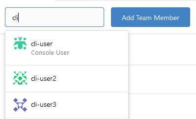
Improve repo search UI ( #29767 )
...
1. Introduce a special "flex-items-block" for menu items, to align the
dropdown menu items
2. Simplify the "repo search" form
3. Add missing "TopicOnly" search option
Screenshots:
The old UI items don't align:
<details>

</details>
New UI (doesn't change much, but the items align)
<details>


</details>
---------
Co-authored-by: silverwind <me@silverwind.io >
2024-03-15 09:45:30 +00:00
silverwind
8b45a62222
Remove scrollbar customizations ( #29800 )
...
Fixes https://github.com/go-gitea/gitea/issues/29652 . Removes all
scrollbar customization as per popular vote on
https://github.com/go-gitea/gitea/issues/29652#issuecomment-1985846162 .
There is one more case of `-webkit-scrollbar` left in CSS and
https://github.com/go-gitea/gitea/pull/29400 will get rid of that as
well.
2024-03-15 04:45:45 +00:00
HEREYUA
b9180e2ccc
Improve branch select list ui in go templates ( #29729 )
...
Relate:[#27417 ](https://github.com/go-gitea/gitea/issues/27471 )
Reference: [#26631 ](https://github.com/go-gitea/gitea/pull/26631 )
Before
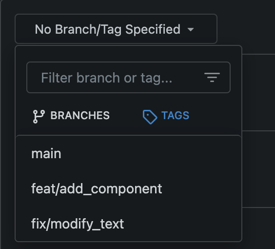
After

---------
Co-authored-by: silverwind <me@silverwind.io >
2024-03-15 11:43:10 +08:00
silverwind
8526c8867a
Fix Citation modal responsiveness and clipboard copy ( #29799 )
...
The modal was broken in two ways:

- On small screens, the input box was partially hanging outside the
modal. Fixed with flexbox and increased modal width.
- The clipboard copy was not working because the modal had both
`data-clipboard-text` and `data-clipboard-target`, while we only support
one of those. Made a small tweak in clipboard as well so that it will
still fall back to target if text is empty.
2024-03-15 02:38:13 +00:00
silverwind
645e3cbc94
Add <overflow-menu>, rename webcomponents ( #29400 )
...
1. Add `<overflow-menu>` web component
2. Rename `<gitea-origin-url>` to `<origin-url>` and make filenames
match.
<img width="439" alt="image"
src="https://github.com/go-gitea/gitea/assets/115237/2fbe4ca4-110b-4ad2-8e17-c1e116ccbd74 ">
<img width="444" alt="Screenshot 2024-03-02 at 21 36 52"
src="https://github.com/go-gitea/gitea/assets/115237/aa8f786e-dc8c-4030-b12d-7cfb74bdfd6e ">
<img width="537" alt="Screenshot 2024-03-03 at 03 05 06"
src="https://github.com/go-gitea/gitea/assets/115237/fddd50aa-adf1-4b4b-bd7f-caf30c7b2245 ">

TODO:
- [x] Check if removal of `requestAnimationFrame` is possible to avoid
flash of content. Likely needs a `MutationObserver`.
- [x] Hide tippy when button is removed from DOM.
- [x] ~~Implement right-aligned items
(https://github.com/go-gitea/gitea/pull/28976 )~~. Not going to do it.
- [x] Clean up CSS so base element has no background and add background
via tailwind instead.
- [x] Use it for org and user page.
---------
Co-authored-by: Giteabot <teabot@gitea.io >
Co-authored-by: wxiaoguang <wxiaoguang@gmail.com >
2024-03-15 02:05:31 +00:00
Denys Konovalov
e18d30abe2
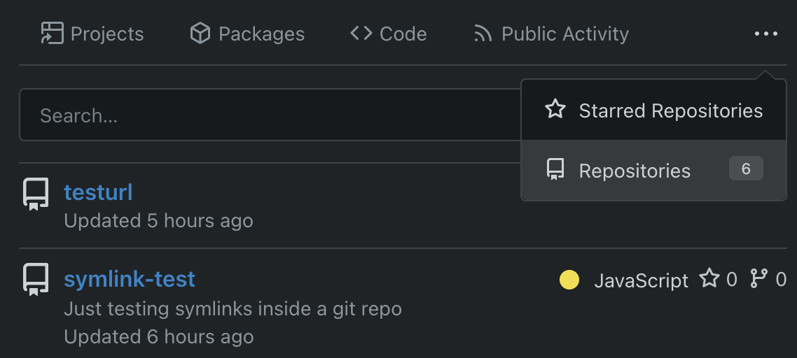
Unify search boxes ( #29530 )
...
Unify all but a few search boxes to use uniform style, uniform
translations and shared templates where possible.
Remove a few duplicated search templates, e. g. code search.
<details><summary>Example after screenshots:</summary>


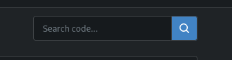
</details>
Also includes #29700
Co-authored-by: 6543 <6543@obermui.de >
---------
Co-authored-by: 6543 <m.huber@kithara.com >
Co-authored-by: 6543 <6543@obermui.de >
Co-authored-by: silverwind <me@silverwind.io >
Co-authored-by: Giteabot <teabot@gitea.io >
2024-03-14 23:24:59 +00:00
silverwind
3407e5724e
Fix Safari spinner rendering ( #29801 )
...
Fixes: https://github.com/go-gitea/gitea/issues/29041
Fixes: https://github.com/go-gitea/gitea/pull/29713

Any of the `width: *-content` properties seem to workaround this Webkit
bug, this one seemed most suitable.
2024-03-14 22:04:33 +00:00
yp05327
8e1490bd56
Improve commit record's ui in comment list ( #26619 )
...
Before:


After:


---------
Co-authored-by: silverwind <me@silverwind.io >
2024-03-14 19:01:16 +00:00
6543
90a126f468
Highlight archived labels ( #29680 )
...
the issue is, that you can not distinguish between normal and archived
labels.
So this will make archived labels 80% **grayscale**. And prepend
"Archived: " to the tooltip info
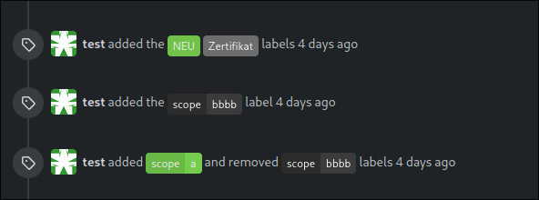
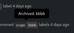


---
*Sponsored by Kithara Software GmbH*
---------
Co-authored-by: delvh <dev.lh@web.de >
2024-03-12 17:32:05 +00:00
silverwind
bc99aa81b4
Improve CSV rendering ( #29638 )
...
Before:
<img width="1332" alt="Screenshot 2024-03-06 at 21 42 17"
src="https://github.com/go-gitea/gitea/assets/115237/0ea07eee-31f8-4783-bd56-37bd8396f00d ">
After:
<img width="1336" alt="Screenshot 2024-03-06 at 21 41 58"
src="https://github.com/go-gitea/gitea/assets/115237/eb7f9cc9-587f-4e3b-92bd-cc67ca639963 ">
2024-03-10 20:28:59 +01:00
silverwind
557961488a
Completely style the webkit autofill ( #29683 )
...
Previously it was only partially styled, e.g. there was black text on
white background even in dark theme caused by fomantic styles.
<img width="195" alt="image"
src="https://github.com/go-gitea/gitea/assets/115237/bc5cf516-2aef-45c3-854a-c9f5497aacca ">
<img width="195" alt="Screenshot 2024-03-09 at 02 09 29"
src="https://github.com/go-gitea/gitea/assets/115237/ef0af17d-6e0b-402e-b24d-bfa34dc2f4e0 ">
Co-authored-by: Giteabot <teabot@gitea.io >
2024-03-09 12:14:42 +00:00
silverwind
a7b8d88f8b
Replace more gt- with tw- ( #29678 )
...
This will conclude the trivial class replacements.
2024-03-08 22:02:05 +01:00
silverwind
57a770213c
Style fomantic grey labels ( #29458 )
...
Fomantic grey labels in the dashboard repo lists were showing original
fomantic colors, fixed that. Also slightly tweaked the light theme
colors so it uses same opacity values as dark theme.
<img width="165" alt="Screenshot 2024-03-07 at 21 06 23"
src="https://github.com/go-gitea/gitea/assets/115237/72744d6f-2ee1-4e5d-8ba0-b482a446f535 ">
<img width="167" alt="Screenshot 2024-03-07 at 21 06 00"
src="https://github.com/go-gitea/gitea/assets/115237/1ba93775-e5a9-4b28-b90f-59c1e9199687 ">
2024-03-08 09:42:12 +00:00
silverwind
c9e83f7f7a
Tweak actions color and borders ( #29640 )
...
- Increase contrast overall
- Unalias the ansi color in dark theme and copy them to light
- Add outer border
- Add border radius
<img width="1337" alt="Screenshot 2024-03-06 at 22 30 03"
src="https://github.com/go-gitea/gitea/assets/115237/11407c0f-0bb2-435e-a034-22b1f106d9b0 ">
<img width="1335" alt="Screenshot 2024-03-06 at 22 36 59"
src="https://github.com/go-gitea/gitea/assets/115237/267db442-0979-4acc-a79e-8579b4cb0262 ">
2024-03-06 22:44:24 +01:00
Rafael Heard
e89a3dd3c6
Move all login and account creation page labels to be above inputs ( #29432 )
...
There are a few inconsistencies within Gitea and this PR addresses one
of them. This PR updates the sign-in page layout, including the register
and openID tabs, to match the layout of the settings pages
(/user/settings) for more consistency.
This PR updates the following routes:
`/user/login`
`/user/sign_up`
`/user/login/openid`
`/user/forgot_password`
`/user/link_account`
`/user/recover_account`
**Before**
<img width="968" alt="Screenshot 2024-02-05 at 8 27 24 AM"
src="https://github.com/go-gitea/gitea/assets/6152817/fb0cb517-57c0-4eed-be1d-56f36bd1960d ">
**After**
<img width="968" alt="Screenshot 2024-02-05 at 8 26 39 AM"
src="https://github.com/go-gitea/gitea/assets/6152817/428d691d-0a42-4a67-a646-05527f2a7b41 ">
This PR addresses a revert of the original PR due to this
[comment](https://github.com/go-gitea/gitea/pull/28753#issuecomment-1956596817 ).
---------
Co-authored-by: rafh <rafaelheard@gmail.com >
2024-03-06 14:20:26 +00:00
silverwind
e95abd7c38
Replace more gt- with tw-, update frontend docs ( #29595 )
...
Tested a few things, all working fine. Not sure if the chinese machine
translation is good.
---------
Co-authored-by: wxiaoguang <wxiaoguang@gmail.com >
2024-03-05 05:29:32 +00:00
wxiaoguang
727daa7c44
Use flex wrap to layout the PR update button ( #29590 )
...
Follow #29418

I think using "flex-wrap: wrap" here is better than hard-coding the screen width.

By using "flex-wrap: wrap", the UI layouts automatically for various
widths (even if in some languages, the sentence might be pretty long)
2024-03-05 03:03:14 +00:00
charles
f4f647220e
Do not exceed display for the PR page buttons on smaller screens ( #29418 )
...
Fixes #29189 .
This is the result after the fix at a width of 768 pixels.

2024-03-04 14:41:53 +00:00
wxiaoguang
232fd2b8e6
Refactor star/watch button ( #29576 )
...
1. Use "star/unstart", but not `{{if}}un{{}}star{{}}` (the same to "watch/unwatch")
2. Use "not-mobile" for hiding the elements on mobile
2024-03-04 12:56:34 +00:00
silverwind
dc58f3c5de
Replace some gt- classes with tw- ( #29570 )
...
Replace 18 `gt-` prefixes with `tw-` with perl replacement. I manually
checked them all with `rg` afterwards.
2024-03-04 03:33:20 +00:00
silverwind
447b9417b3
Lighten text colors on dark theme for increased contrast ( #29481 )
...
Improve contrast by lightening the text colors in dark theme by around
35%. Additionally, share some variables that had the same or similar
color, which will ease future theme creation.
2024-02-29 05:11:11 +00:00
silverwind
83319cd366
Improve contrast on blame timestamp, fix double border ( #29482 )
...
Before, double border on top, bad contrast on dark:
<img width="155" alt="Screenshot 2024-02-29 at 02 06 17"
src="https://github.com/go-gitea/gitea/assets/115237/fc0f1e08-a5ce-47ed-9eb6-135eed5a1abb ">
<img width="126" alt="Screenshot 2024-02-29 at 02 07 28"
src="https://github.com/go-gitea/gitea/assets/115237/38ae8483-8d9b-484c-8909-d4466131ea16 ">
After, no double border on top, good contrast:
<img width="154" alt="Screenshot 2024-02-29 at 02 20 20"
src="https://github.com/go-gitea/gitea/assets/115237/ad91282b-e9f5-4f41-8f5e-6ba28db3beac ">
<img width="147" alt="Screenshot 2024-02-29 at 02 20 38"
src="https://github.com/go-gitea/gitea/assets/115237/7ee2ec92-e72a-4981-aec3-98fc8e579bae ">
2024-02-29 10:00:33 +08:00
silverwind
1797fbf765
Apply compact padding to small buttons with svg icons ( #29471 )
...
The buttons on the repo release tab were larger in height than on other
tabs because one of them contained the RSS icon which stretched the
button height by 3px. Workaround this problem by applying the "compact"
padding to any such button. They are within 0.4px in height now to
non-icon buttons.
Before:
<img width="406" alt="Screenshot 2024-02-28 at 15 30 23"
src="https://github.com/go-gitea/gitea/assets/115237/805bb93a-6fe4-40a0-82d1-03001bee8ecf ">
After:
<img width="407" alt="Screenshot 2024-02-28 at 15 38 43"
src="https://github.com/go-gitea/gitea/assets/115237/27707588-890f-4852-ab08-105a57eda880 ">
For comparison, button on issue tab:
<img width="452" alt="Screenshot 2024-02-28 at 15 31 46"
src="https://github.com/go-gitea/gitea/assets/115237/74ac13d5-d016-49ba-9dd9-40ed32a748e9 ">
2024-02-28 21:26:12 +01:00
silverwind
f99447f8dc
Recolor dark theme to blue shade ( #29283 )
...
Now uses the same primary color as light theme. The secondary colors are
shifted towards a slightly blue shade. Could maybe desaturate a bit
more, but overall I think I'm happy with it.
Fixes: https://github.com/go-gitea/gitea/issues/27097
<img width="1343" alt="Screenshot 2024-02-27 at 22 21 46"
src="https://github.com/go-gitea/gitea/assets/115237/4163c393-b469-4a53-8f4b-1c33aa04f3ac ">
<img width="581" alt="image"
src="https://github.com/go-gitea/gitea/assets/115237/e621f7f8-5679-4605-bf42-3d5ff1071e1e ">
<img width="581" alt="image"
src="https://github.com/go-gitea/gitea/assets/115237/20e66493-2457-482b-b8f1-e5710934e189 ">
---------
Co-authored-by: Giteabot <teabot@gitea.io >
2024-02-28 11:16:15 +01:00
Lunny Xiao
82ff1f2f15
Use tailwind instead of gt-[wh]- helper classes ( #29423 )
...
Follow #29357
- Replace `gt-w-*` -> `tw-w-*` and remove `gt-w-*`
- Replace `gt-h-*` -> `tw-h-*` and remove `gt-h-*`
2024-02-27 14:31:41 +00:00
silverwind
551ef9ced6
Add tailwindcss ( #29357 )
...
This will get tailwindcss working on a basic level. It provides only the
utility classes, e.g. no tailwind base which we don't need because we
have our own CSS reset. Without the base, we also do not have their CSS
variables so a small amount of features do not work and I removed the
generated classes for them.
***Note for future developers: This currently uses a `tw-` prefix, so we
use it like `tw-p-3`.***
<details>
<summary>Currently added CSS, all false-positives</summary>
```
.\!visible{
visibility: visible !important
}
.visible{
visibility: visible
}
.invisible{
visibility: hidden
}
.collapse{
visibility: collapse
}
.static{
position: static
}
.\!fixed{
position: fixed !important
}
.absolute{
position: absolute
}
.relative{
position: relative
}
.sticky{
position: sticky
}
.left-10{
left: 2.5rem
}
.isolate{
isolation: isolate
}
.float-right{
float: right
}
.float-left{
float: left
}
.mr-2{
margin-right: 0.5rem
}
.mr-3{
margin-right: 0.75rem
}
.\!block{
display: block !important
}
.block{
display: block
}
.inline-block{
display: inline-block
}
.inline{
display: inline
}
.flex{
display: flex
}
.inline-flex{
display: inline-flex
}
.\!table{
display: table !important
}
.inline-table{
display: inline-table
}
.table-caption{
display: table-caption
}
.table-cell{
display: table-cell
}
.table-column{
display: table-column
}
.table-column-group{
display: table-column-group
}
.table-footer-group{
display: table-footer-group
}
.table-header-group{
display: table-header-group
}
.table-row-group{
display: table-row-group
}
.table-row{
display: table-row
}
.flow-root{
display: flow-root
}
.inline-grid{
display: inline-grid
}
.contents{
display: contents
}
.list-item{
display: list-item
}
.\!hidden{
display: none !important
}
.hidden{
display: none
}
.flex-shrink{
flex-shrink: 1
}
.shrink{
flex-shrink: 1
}
.flex-grow{
flex-grow: 1
}
.grow{
flex-grow: 1
}
.border-collapse{
border-collapse: collapse
}
.select-all{
user-select: all
}
.resize{
resize: both
}
.flex-wrap{
flex-wrap: wrap
}
.overflow-visible{
overflow: visible
}
.rounded{
border-radius: 0.25rem
}
.border{
border-width: 1px
}
.text-justify{
text-align: justify
}
.uppercase{
text-transform: uppercase
}
.lowercase{
text-transform: lowercase
}
.capitalize{
text-transform: capitalize
}
.italic{
font-style: italic
}
.text-red{
color: var(--color-red)
}
.text-shadow{
color: var(--color-shadow)
}
.underline{
text-decoration-line: underline
}
.overline{
text-decoration-line: overline
}
.line-through{
text-decoration-line: line-through
}
.outline{
outline-style: solid
}
.ease-in{
transition-timing-function: cubic-bezier(0.4, 0, 1, 1)
}
.ease-in-out{
transition-timing-function: cubic-bezier(0.4, 0, 0.2, 1)
}
.ease-out{
transition-timing-function: cubic-bezier(0, 0, 0.2, 1)
}
```
</details>
---------
Co-authored-by: Giteabot <teabot@gitea.io >
2024-02-25 17:46:46 +01:00
Tim-Nicas Oelschläger
0510c4416b
Unify organizations header ( #29248 )
...
Unify organizations header
before:
after:

---------
Co-authored-by: silverwind <me@silverwind.io >
2024-02-23 01:24:57 +01:00
Lunny Xiao
f20a32e4b1
Revert #28753 because UI broken. ( #29293 )
...
Revert #29255
Revert #28753
2024-02-21 22:14:37 +08:00
Rafael Heard
61bd56cdaf
Left align the input labels for the link account page ( #29255 )
...
In a previous [PR](https://github.com/go-gitea/gitea/pull/28753 ) we
moved the labels to be above the inputs. The PR ensures that the
alignment is also on both tabs of the link account page
(`/user/link_account`).
Before
<img width="1094" alt="before"
src="https://github.com/go-gitea/gitea/assets/6152817/ac1e86bd-c4d6-4e45-87d1-87bb8a736149 ">
After
<img width="1094" alt="after"
src="https://github.com/go-gitea/gitea/assets/6152817/1b5fc109-f4d2-43ee-b924-0a9e53a0e391 ">
---------
Co-authored-by: rafh <rafaelheard@gmail.com >
2024-02-19 20:01:48 -05:00
silverwind
ecf7fdc976
Clean up diff header css and reduce global textarea min-height ( #29232 )
...
1. Tweak diff header and remove a numbe of unneeded CSS for it:
Before:
<img width="433" alt="Screenshot 2024-02-18 at 01 08 09"
src="https://github.com/go-gitea/gitea/assets/115237/d8b377c0-57bc-44d5-bb57-a582c7d4b3b4 ">
After:
<img width="463" alt="Screenshot 2024-02-18 at 01 07 56"
src="https://github.com/go-gitea/gitea/assets/115237/d08c17e7-5b86-4d07-81da-6371f4754325 ">
3. Reduce height of review textarea and also reduce fomantic's CSS from
12em to 8em. Now fits better on my screen:
<img width="1352" alt="image"
src="https://github.com/go-gitea/gitea/assets/115237/5c658d13-295e-4929-94da-13ade888020d ">
---------
Co-authored-by: delvh <dev.lh@web.de >
2024-02-18 14:51:21 +00:00
Tim-Nicas Oelschläger
8b1c6d9d69
Change webhook-type in create-view ( #29114 )
...
It's now possible to change webhook-type in create-view.
before:
after:

---------
Co-authored-by: silverwind <me@silverwind.io >
Co-authored-by: Giteabot <teabot@gitea.io >
2024-02-15 14:59:48 +01:00
Rafael Heard
2cbbce4574
move sign in labels to be above inputs ( #28753 )
...
There are a few inconsistencies within Gitea and this PR addresses one of them.
This PR updates the sign-in page layout, including the register and openID tabs,
to match the layout of the settings pages (`/user/settings`) for more consistency.
**Before**
<img width="968" alt="Screenshot 2024-02-05 at 8 27 24 AM"
src="https://github.com/go-gitea/gitea/assets/6152817/fb0cb517-57c0-4eed-be1d-56f36bd1960d ">
**After**
<img width="968" alt="Screenshot 2024-02-05 at 8 26 39 AM"
src="https://github.com/go-gitea/gitea/assets/6152817/428d691d-0a42-4a67-a646-05527f2a7b41 ">
---------
Co-authored-by: rafh <rafaelheard@gmail.com >
2024-02-15 09:47:49 +01:00
Yarden Shoham
46c986ae00
Add alert blocks in markdown ( #29121 )
...
- Follows https://github.com/go-gitea/gitea/pull/21711
- Closes https://github.com/go-gitea/gitea/issues/28316
Implement GitHub's alert blocks markdown feature
Docs:
-
https://docs.github.com/en/get-started/writing-on-github/getting-started-with-writing-and-formatting-on-github/basic-writing-and-formatting-syntax#alerts
- https://github.com/orgs/community/discussions/16925
### Before
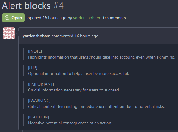
### After

## ⚠️ BREAKING ⚠️
The old syntax no longer works
How to migrate:
If you used
```md
> **Note** My note
```
Switch to
```md
> [!NOTE]
> My note
```
---------
Signed-off-by: Yarden Shoham <git@yardenshoham.com >
Co-authored-by: silverwind <me@silverwind.io >
Co-authored-by: Giteabot <teabot@gitea.io >
2024-02-10 18:43:09 +00:00
silverwind
dfc90f38de
Remove obsolete border-radius on comment content ( #29128 )
...
This border-radius is obsolete since we changed the comment rendering a
few months ago and it caused incorrect display on blockquotes.
Before:
<img width="160" alt="Screenshot 2024-02-10 at 18 42 48"
src="https://github.com/go-gitea/gitea/assets/115237/ccbf4660-acf9-4268-aad9-1ad49d317a67 ">
After:
<img width="135" alt="Screenshot 2024-02-10 at 18 42 40"
src="https://github.com/go-gitea/gitea/assets/115237/6f588e02-3b2a-49ee-b459-81d8068b2f4e ">
2024-02-10 20:18:46 +02:00
Yarden Shoham
ee0baecdbe
Make blockquote border size less aggressive ( #29124 )
...
It's too thick
I made it match GitHub's size
# Before
# After
Signed-off-by: Yarden Shoham <git@yardenshoham.com >
2024-02-10 14:55:46 +02:00
KN4CK3R
5cd1e692a5
Improve user search display name ( #29002 )
...
I tripped over this strange method and I don't think we need that
workaround to fix the value.
old:
new:
---------
Co-authored-by: silverwind <me@silverwind.io >
Co-authored-by: wxiaoguang <wxiaoguang@gmail.com >
2024-02-01 17:10:16 +00:00
Yarden Shoham
28741dcc2c
Make loading animation less aggressive ( #28955 )
...
The current animation loops in a very fast manner, causing a slight
feeling of uncomfortableness. This change slows it a bit for a smoother
experience.
# Before
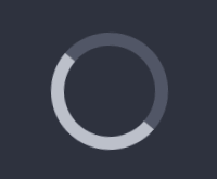
# After

Signed-off-by: Yarden Shoham <git@yardenshoham.com >
2024-01-27 20:27:37 +08:00
Jimmy Praet
904f83c7ad
Don't reload timeline page when (un)resolving or replying conversation ( #28654 )
...
Fixes #15981
2024-01-24 03:26:28 +00:00
JakobDev
2cbd4e948a
Show latest commit for file ( #28067 )
...
If you view a file, you can now see the latest commit that changed that file.

---------
Co-authored-by: Denys Konovalov <kontakt@denyskon.de >
2024-01-15 17:42:15 +01:00
wxiaoguang
228d2f8588
Fix button size in "attached header right" ( #28770 )
...
Before:
<details>

</details>
After:


2024-01-12 14:43:40 +00:00
wxiaoguang
07d50cc3a3
Improve CSS helper naming ( #28769 )
...
* `gt-w-100` => `gt-w-full` to match tailwind
* clarify `gt-hidden` priority
2024-01-12 20:28:01 +08:00
Denys Konovalov
abc37d6a62
Revamp repo header ( #27760 )
...
Redesign repo header with following new aspects:
- responsive & better-looking repo title
- hide repo button text instead of icons in mobile view
- use same tab style as on explore and org page
<details>
<summary>Before:</summary>


</details>
<details>
<summary>After:</summary>


2024-01-12 03:44:06 +00:00
Kyle D
31d4097bf9
Add merge arrow direction and update styling ( #28523 )
...
Close https://github.com/go-gitea/gitea/issues/28522
~Adds some [negative
margin](https://tailwindcss.com/docs/margin#using-negative-values )
helper css classes using tailwind's [prefix
syntax](https://tailwindcss.com/docs/configuration#prefix )~
### Before
### After
2024-01-05 17:38:56 +00:00
Earl Warren
fb5d235193
Apply min-height in wiki only on preview pane ( #28687 )
...
In the commit 1e4d7140c3https://codeberg.org/forgejo/forgejo/pulls/2080
(cherry picked from commit 8f0baefe5dadc929fe7456c36c8b205e96f228f0)
Co-authored-by: Fl1tzi <git@fl1tzi.com >
2024-01-04 02:48:55 +00:00
Denys Konovalov
08debf8183
Fix wrapping of label list ( #28684 )
...
The label list needs to wrap the items to avoid unnecessary overflow / incorrect text wrapping.
2024-01-03 20:33:55 +08:00
wxiaoguang
5a556c7cca
Fix flex container width ( #28603 )
...
Fix #28489
2023-12-24 22:39:02 +08:00
KazzmanK
0624668055
Decrease issue font size in project template ( #28054 )
...
I propose to decrease font size. 18 is too big and looks ugly, on
windows. 14 is on par with other elements and save a bit of space.


Co-authored-by: Nikolay Kobzarev <n.kobzarev@aeronavigator.ru >
2023-11-19 02:02:26 +00:00
sebastian-sauer
87d0bcebd8
Fix Show/hide filetree button on small displays ( #27881 )
...
the gt-df's display:flex !important did override the display:none on small displays
---------
Co-authored-by: wxiaoguang <wxiaoguang@gmail.com >
2023-11-17 18:35:51 +00:00
sebastian-sauer
aae0f0d351
Improve PR diff view on mobile ( #27883 )
...
1. Show diff stats only on large screens
these are already shown in tabs, so no need for this duplicate
information on small screens
2. Hide viewed files information on small screens
Github does the same and this gives us more free space on small screens

3. Review bar now doesn't wrap so we don't need the 77px even on very
small screens
(the sticky headers are still working)

2023-11-16 11:58:53 +08:00